Implement Header-Designs #6
No Assignees
Notifications
Due Date
No due date set.
Dependencies
No dependencies set.
Reference: Shop/Shop-Storefront#6
Reference in New Issue
Block a user
Delete Branch "%!s()"
Deleting a branch is permanent. Although the deleted branch may continue to exist for a short time before it actually gets removed, it CANNOT be undone in most cases. Continue?
Recreate Header-Designs with medusa ui components and custom components.
Update JSON files and Component Map accordingly.
Conclusion:
I have push the design json file and layout component in branch
namds/refactor-base-layoutand here is the list of reuseable dynamic UI component i have added:And for menu entries, only categories by medusa api are working right now
Start design storefront
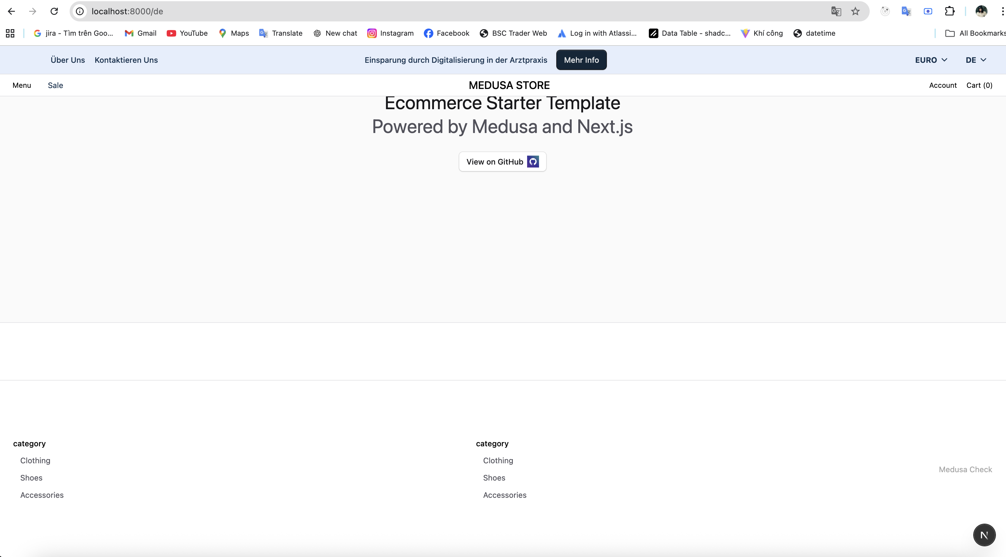
Header — JSON Configuration Guide
This guide explains how to configure the
Headerblock inconfig/nam.vibentec.design.json. It covers structure, keys, and typical edits without file line references.Location
layoutinconfig/nam.vibentec.design.jsonas a top-levelHeaderobject.configblock (e.g.,sticky) and achildrenarray with header components.Minimal Structure
Config Keys
sticky: Boolean. Whentrue, the header stays fixed at the top.children: Array of components rendered in the header. Common entries areBannerandNav.Banner (Top Bar)
Key fields:
variant: e.g.,"nav".className: styling of the bar.left/center/right: arrays to place child controls.Linkitems withlabel,href,className.Linkitems for promos or CTAs.Dropdownfor currency andVtCountryCodeSelectfor region selector.Example (add a left link):
Place this inside
Banner.config.left.Nav (Main Navigation)
Key fields:
className: overall styling of the nav bar.src,alt,className, andobjectFitunderLogo.config.Link.config.label/href.VtMegaMenu.config.navLabel.textand styling.SearchInput.config.placeholder.AccountButton,Button(wishlist), andVtCartButtonicons and classes.Example (change the logo):
Edit values under
Logo.config.Common Edits
"sticky"inHeader.config.Link.config.label/hrefinBanner.Dropdown.config.trigger.textanditems.classNamestrings inBannerandNav.LinkandVtMegaMenuconfigs.iconfields inAccountButton,Button,VtCartButton.Adding or Reordering Children
Header.childrenis an ordered array; earlier items render above/before later ones.config:Tips
left/center/rightarrays to position child items withinBannerand similar components."User","Heart","ShoppingCart") must exist in the icon set.This guide explains the
Headerconfiguration so you can make precise edits quickly.